Teamwork
Quantitative User Research
User Personas
Customer journey
Information Architecture
Card Sorting
Mapping Methode
Wireframe
Prototype
User Testing
Responsive Design
UI Design
Teamwork
Quantitative User Research
User Personas
Customer journey
Information Architecture
Card Sorting
Mapping Methode
Wireframe
Prototype
User Testing
Responsive Design
UI Design
Alfatraining offers further training, retraining and company seminars on site throughout Germany and also online. You want to increase the satisfaction of your customers with a modern and target group-orientated website.
Issues
A wide range of courses and school locations needs to be better organised. This makes it difficult for users to find and book the right courses.
Goal
Through UX research and design, the website is customised to the needs of the user.
A better information structure of the content, which is made possible by user-friendliness, should restore the conversion rate.
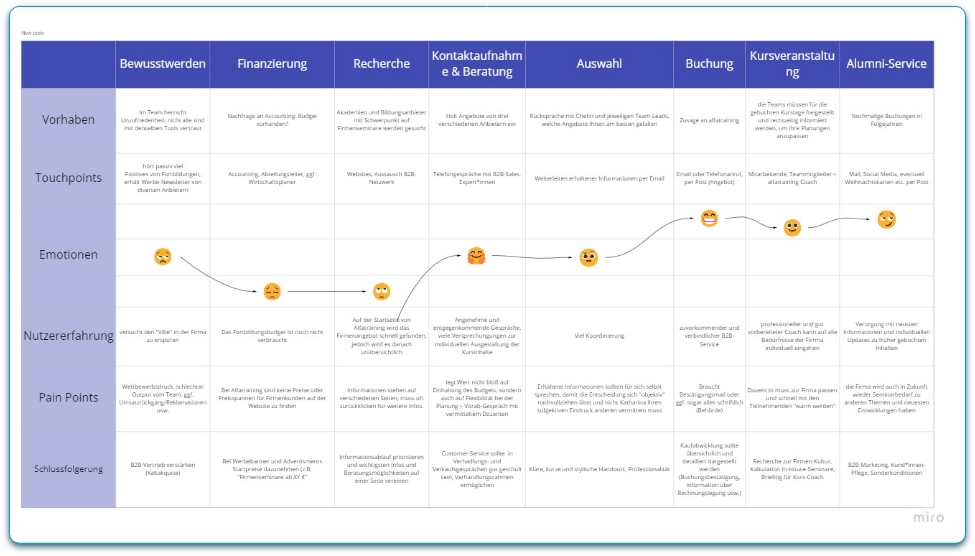
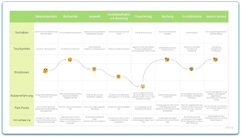
Personas & Customer Journey
At alfatraining, we meticulously analyzed survey results and company information to identify three distinct target groups. The details are outlined below. Armed with a comprehensive understanding of these target groups, we proceeded to craft potential customer journey scenarios, fostering a deep sense of empathy with our users.
Sofia represents that part of the target group that already has a stable gold but does not feel completely fulfilled or simply wants to keep up to date with updates and new techniques. The goal is to achieve economic independence that allows her to balance her working and private life.
1.Employees
Sofia represents that part of the target group that already has a stable gold but does not feel completely fulfilled or simply wants to keep up to date with updates and new techniques. The goal is to achieve economic independence that allows her to balance her working and private life.
2.Human Resources
Katharina wants to create harmony and trust in her team. She wants her employees to be able to stay up-to-date and thus create more job satisfaction.
2.Human Resources
Katharina wants to create harmony and trust in her team. She wants her employees to be able to stay up-to-date and thus create more job satisfaction.
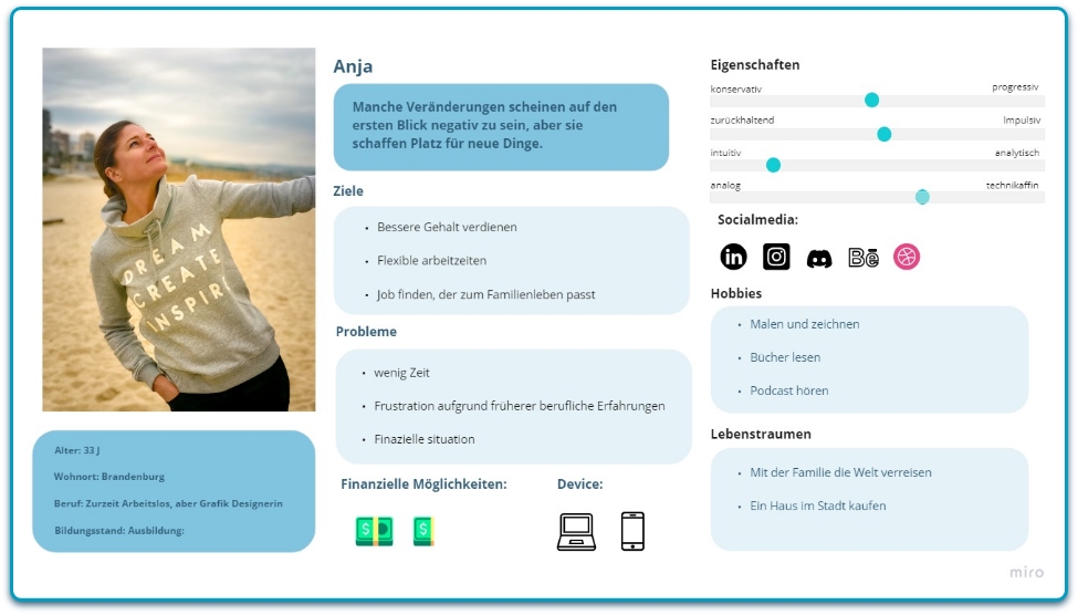
3.Career changers
Anja is itching to get back into her working life after being on maternity leave. She realised that she would like to change sectors and is ready to start again with a new training course to achieve her goals.
3.Career changers
Anja is itching to get back into her working life after being on maternity leave. She realised that she would like to change sectors and is ready to start again with a new training course to achieve her goals.
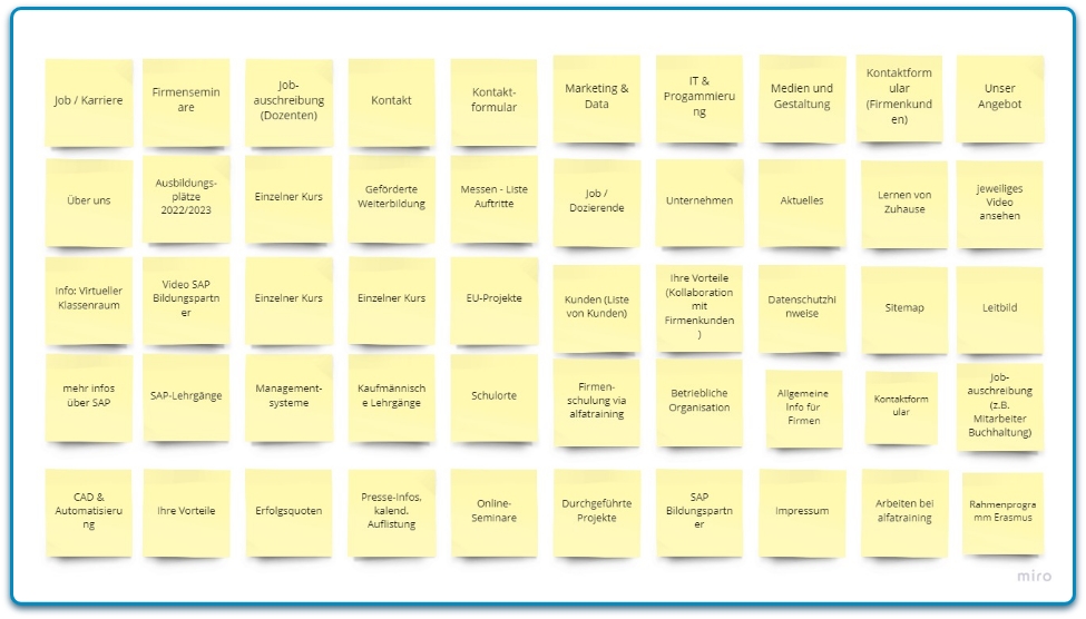
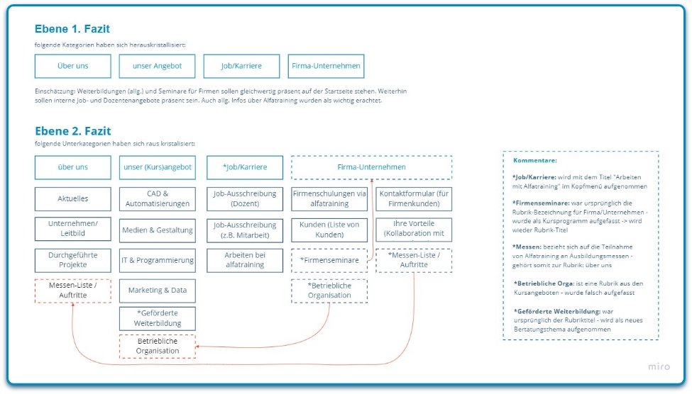
Card Sorting & Results
For card sorting, 3 people were interviewed. The results were very impressive, managing to create a hierarchy of site elements and navigation that matched all user needs
Card Sorting & Results
For card sorting, 3 people were interviewed. The results were very impressive, managing to create a hierarchy of site elements and navigation that matched all user needs
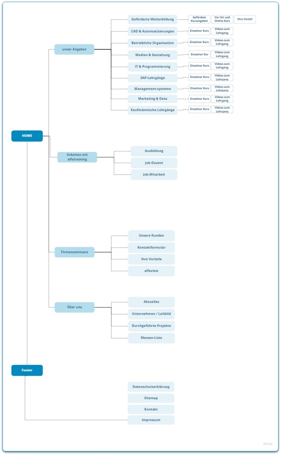
Information Architecture
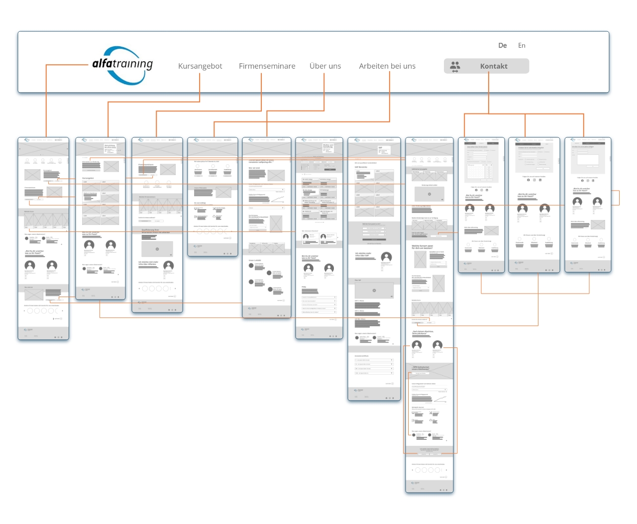
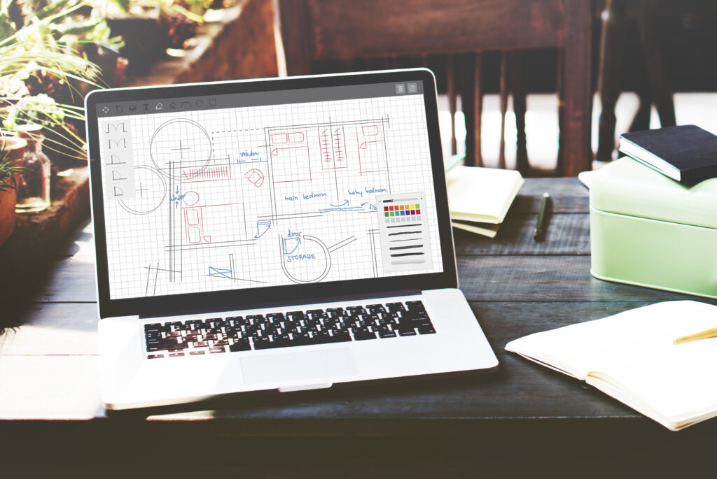
Wireframe Desktop
My usability testing work
For usability testing, each team member created his or her own Wireframe,
following pre-established guidelines.
Each member conducted their own usability tests with a total of 10 participants. For my usability test, I took three participants to test how the user interacts with the home page of the site.
Here I show you mine, for the complete project you can look at the whole project.
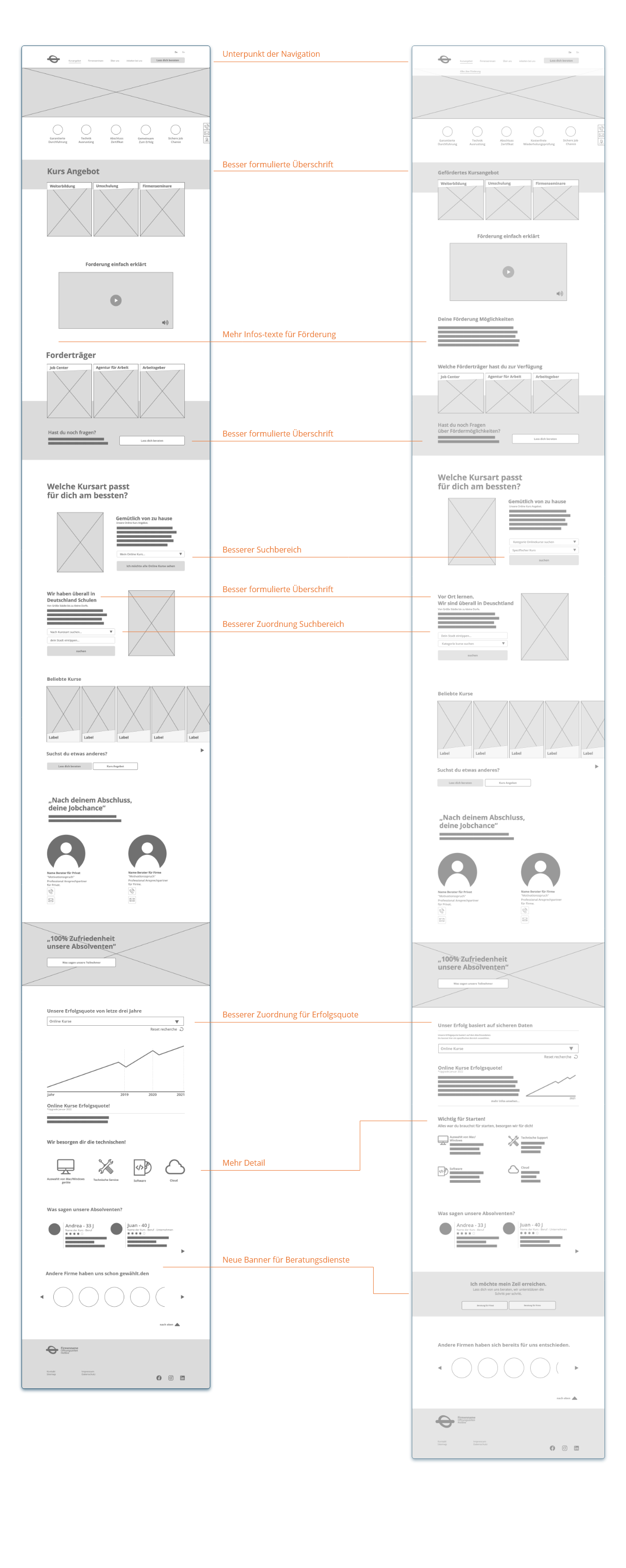
Before
Usability test result
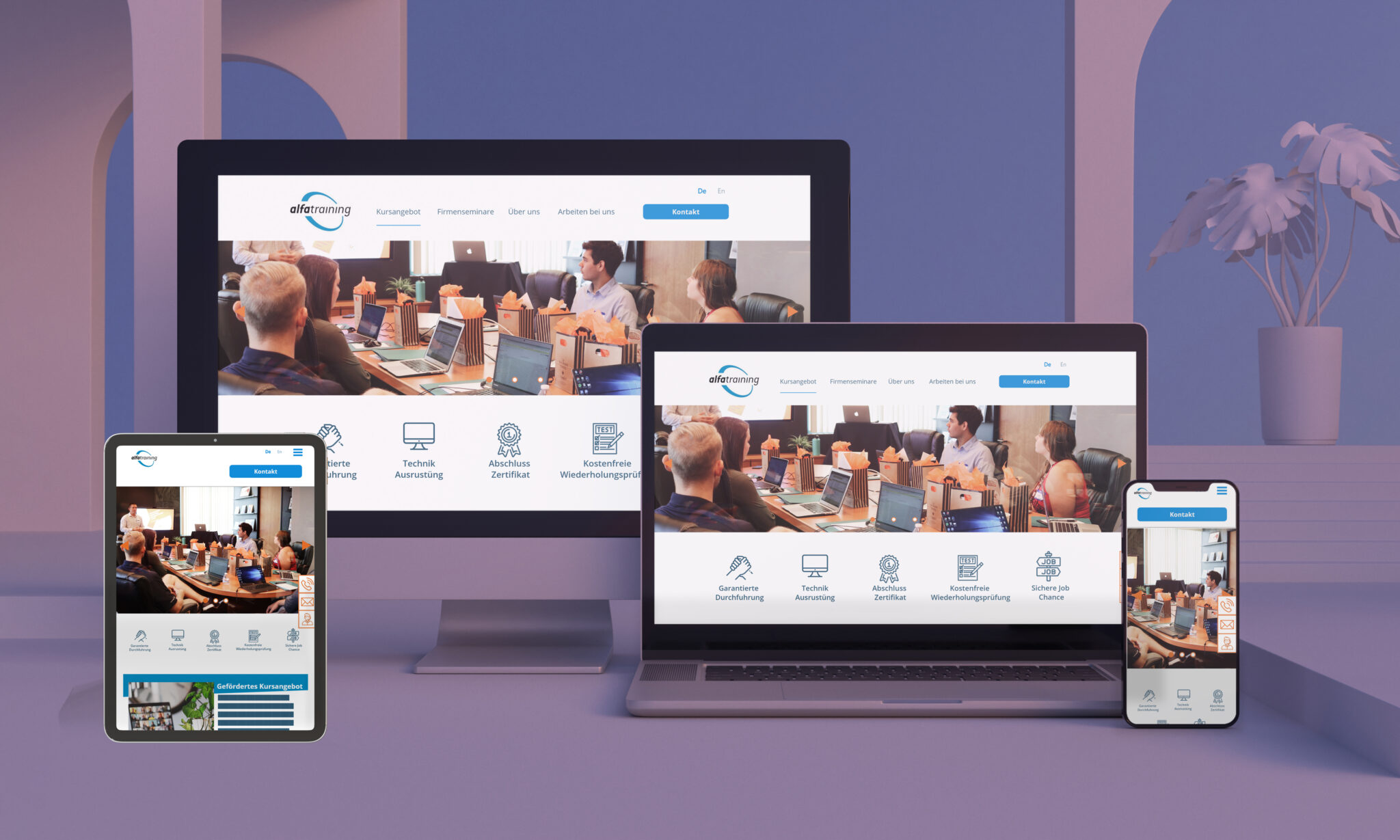
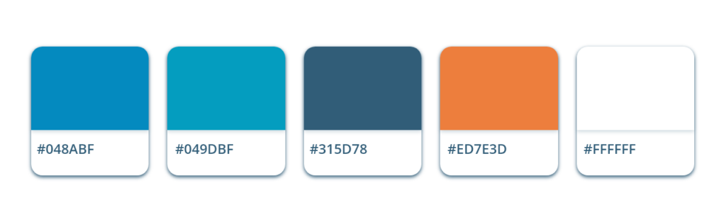
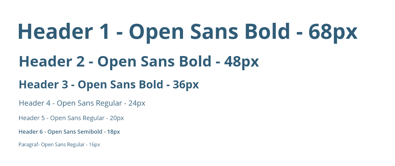
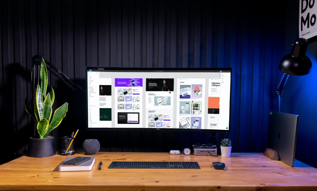
UI Design
For Visual Design I followed the school’s corporate identity, trying to give it a more modern and functional design. The main colours are various shades of light blue and blue to convey confidence and professionalism, and orange for creativity. The font used is Open Sans. A harmonious result is achieved through the use of illustrations and the scaling of the images.
The imagery for the courses on offer represents various workstations with laptops for the respective course type.
Information Architecture
Wireframe Desktop
My usability testing work
For usability testing, each team member created his or her own Wireframe,
following pre-established guidelines.
Each member conducted their own usability tests with a total of 10 participants. For my usability test, I took three participants to test how the user interacts with the home page of the site.
Here I show you mine, for the complete project you can look at the whole project.
Before
Usability test result
UI Design
For Visual Design I followed the school’s corporate identity, trying to give it a more modern and functional design. The main colours are various shades of light blue and blue to convey confidence and professionalism, and orange for creativity. The font used is Open Sans. A harmonious result is achieved through the use of illustrations and the scaling of the images.